Go Learn Branding Guidelines
This guide is to establish Go Learn's brand identity in a way that promotes efficiency, flexibility, and consistency. It includes the following elements: official logos, colors, typography, writing guide, photography, and illustration.
Program Logos
Primary Logo
The Go Learn logo is an exception to the normal secondary logos rule for departments that follow the University of Utah brand guideline. It has three elements: the big "GO" in italicized caps, the "Learn" in a script font that likens the script fonts used in vintage travel posters, and the two lines that end in an arrow on the right.
Whenever representing Go Learn, use this logo. However, in no situation should the Go Learn logo be alone. The University of Utah logo should always be somewhere on the piece as well.
When the background blends with the black text or the red text, use the white logo. When the background is dark gray or black use the inverted logo.
When putting the Go Learn and different University of Utah logos together please refer to the rules below.

Secondary Logo with The University of Utah Logo Lockup
When combining the Go Learn logo with The University of Utah logo, the Go Learn is above and to the left of The University of Utah logo. The University of Utah logo is nestled in the empty space under the 2 lines of the Go Learn logo.


Secondary Logo with the Official Travel Provider U Alumni Logo LockUp
When combining the Go Learn logo with the Official Travel Provider U Alumni logo, the Go Learn is on the left and centered vertically with of the Official Travel Provider U Alumni logo. Use this logo on all deliverables that will be viewed by alumni.


Understanding Logo File Formats
JPG and PNG are best for putting a logo on the web. This format will provide great color and PNG files have a transparent background. RGB (red, green, blue) is the best color mode for the web.
The best file format for print is an EPS file. It has the highest resolution to avoid pixilation when printing. CYMK (cyan, yellow, magenta, black) is the best color mode for print.
Logo Misuse and Exceptions
It is important that the appearance of the logo remains consistent. The logo should not be misinterpreted, modified, or added to. No attempt should be made to alter the logo in any way. Its orientation, elements and composition should remain as indicated in this document.
No
Do not change the fonts at all.
No
Do not distort the logo in anyway.
No
Do not use the wordmark without the lines and arrow.
Yes
Go Learn logo color can be changed to complement the illustration that it's housed on. In all other situations, only red, black, or white are acceptable.
Primary Colors
The most important color we identify with is the University of Utah red, and it should
be used predominantly. Go Learn uses the University of Utah's official colors of red,
black, and gray.
 U of U Red
#cc0000
RGB 204-0-0
CYMK O|100|79|20
 Black
Black#000000
RGB 0-0-0
CYMK 0|0|0|100
 Gray
Gray#808080
RGB 128-128-128
CYMK 0|0|0|60
Secondary Colors
Accent colors, when used, should be complementary and supporting to the red and black. It is strongly recommended that designers avoid using blue, purple, or green as stand-alone colors to avoid creating confusion.
 Savanna Tan
Pantone 7500
#DACFAC
RGB 218-207-172
CYMK 15|14|34|0
 Mediterranean Sage
Pantone 5585
#A2BAB0
RGB 162-186-176
CYMK 38|17|31|0
 Aeolian Shallows
Pantone 5497
#799E9F
RGB 121-158-159
CYMK 56|27|35|1
 Rockies Grey
Pantone 410
#656160
RGB 101-97-96
CYMK 59|54|53|24
Typography
Lato, Cabrito, and Adobe Caslon Pro are Lifelong Learning's official font families
to use in advertising and outreach.

Myriad Pro can be used for headers and body copy in brochures, flyers, letters, etc. It looks effective when set in 9, 10, 11, and 12pt types.

Industria LT STD is recommended for use with large titles and headlines and looks most effective when it is used at 20pt and above.

New Baskerville STD Bold can be used for body copy in special situations, call-outs, and anything that needs to be italicized.
Writing
Consistency of style and usage makes reading easier. These style guides are designed to increase the effectiveness of University of Utah publications by encouraging stylistic consistency and sensible usage campus-wide. To view the most updated version visit University Marketing's site.
Photography
Photos should be beautiful and historic showing vast landscapes, buildings and monuments that will be seen on these Go Learn trips. Photos should not look not overly styled. They should mainly focus on scenery and try to avoid having any people in the photos. Silhouettes and human objects like bicycles, for example, are acceptable.
We have a library of images on PhotoShelter for Go Learn and its partners to use and additional link to the University of Utah's photo library.
If you need to shoot new photos for a specific need, it is very important that the photos follow the above guidelines and avoid clichéd poses or effects. All our photography should support our brand attributes through characteristics of the environments.
If you would like to schedule a photo shoot, please submit a ticket.
Note: To download images from Go Learn's Photoshelter, use the gallery password uofucece.




Illustrations
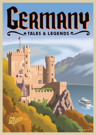
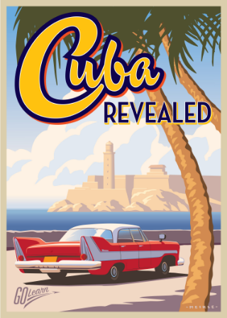
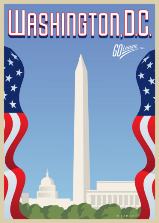
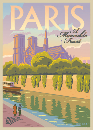
To promote the trip, illustrations have a vintage travel poster feel with a modern take with a flattened, 2-dimensional style for the main image. Illustrations should focus and feature famous landmarks that will be visited on the trip. These illustrations are also always presented with a tan border around them to pay homage to vintage travel posters. The headline of the trip title should be the city or country the trip is taking place. The subheader of the trip can be the descriptor of the trip.
We have a library of these illustrations on PhotoShelter for Go Learn and its partners to use.
All illustrations are done by David Meikle.
Note: To download images from Go Learn's Photoshelter, use the gallery password uofucece.
ENTER THE go learn's illustration library
